Layouts
Flutter tutorial by examplesFlutter provides a rich set of layout widgets that allow you to position and size your UI elements in various ways, such as columns, rows, stacks, and more. In Flutter, a layout refers to the way in which widgets are arranged and positioned on the screen. Flutter provides a rich set of built-in layout widgets that can be used to create a variety of layouts, from simple to complex. Some of the most commonly used layout widgets in Flutter include:
- Container: A container widget is used to group other widgets together and provide padding, margins, borders, and backgrounds.
- Column: A column widget arranges its child widgets vertically, from top to bottom.
- Row: A row widget arranges its child widgets horizontally, from left to right.
- Expanded: An expanded widget is used to stretch its child widget to fill the available space.
- Stack: A stack widget places its child widgets on top of each other, allowing them to overlap.
- GridView: A GridView widget displays its child widgets in a grid layout, with rows and columns.
- ListView: A ListView widget displays its child widgets in a scrollable list, either vertically or horizontally.
- Wrap: A wrap widget arranges its child widgets in a wrap layout, wrapping them to the next line if there is not enough space.
- Flutter layouts can be customized and styled using various properties, such as alignment, padding, margin, and background color. With Flutter's flexible layout system, developers can create dynamic and responsive user interfaces that adapt to different screen sizes and orientations.
An important widget is the container that can contains several child widgets and manage them by setting their width, height, content, background color.
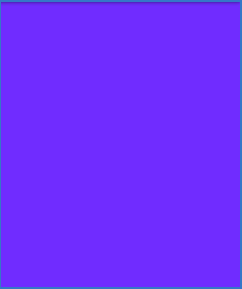
This app shows simple container which has a blue-violet background.
//simple dart program
  import 'package:flutter/material.dart';


  void main() => runApp(MyApp());


  class MyApp extends StatelessWidget{
    @override
    Widget build(BuildContext context) {
      return Container(
        color: Colors.blueAccent,
      );
    }
  }
This is a simple Dart program that creates a Flutter app that displays a blue colored container on the screen. The program consists of a main() function that calls the MyApp() widget to run.
The MyApp widget is defined as a StatelessWidget and overrides the build() method to build the user interface. In this case, the build() method returns a Container widget with a blueAccent color. The Container widget is a basic layout widget that provides a rectangular box for other widgets to be placed inside.
The color property of the Container widget is set to Colors.blueAccent, which is a pre-defined color in the Flutter framework.
Overall, this program demonstrates how to create a simple container with a background color in Flutter using the Container widget. With Flutter's extensive collection of pre-built widgets and customizable properties, developers can create beautiful and dynamic user interfaces that meet the needs of their app. However, this program is not very useful as it only displays a blue container and does not have any functionality or user interaction.
This is another simple container which has white text on a yellow background.
//simple container which has white text on a yellow background

  import 'package:flutter/material.dart';

  void main() => runApp(MyApp());

  /// This Widget is the main application widget.
  class MyApp extends StatelessWidget {

    @override
    Widget build(BuildContext context) {
      return MaterialApp(
        home: MyContainerWidget(),
      );
    }
  }

  class MyContainerWidget extends StatelessWidget {
    @override
    Widget build(BuildContext context) {
      return MaterialApp(
        home: Scaffold(
          appBar: AppBar(
            title: Text("Flutter Container Example"),
          ),
          body: Container(
            width: double.infinity,
            height: 150.0,
            color: Colors.amber,
            margin: EdgeInsets.all(25),
            padding: EdgeInsets.all(35),
            alignment: Alignment.center,
          //  transform: Matrix4.rotationZ(0.1),
            child: Text("How to set background and text color in Flutter!",
                style: TextStyle(fontSize: 25,color: Colors.white)),
          ),
        ),
      );
    }
  }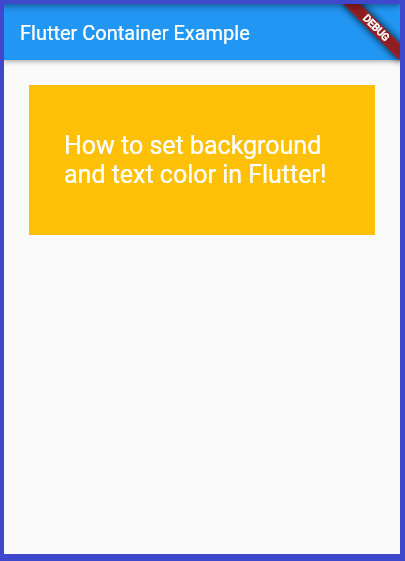
This is a Flutter program that displays a container with white text on a yellow background. The program starts with the main() function that calls the MyApp() widget to run.
The MyApp widget is defined as a StatelessWidget and overrides the build() method to build the user interface. In this case, the build() method returns a MaterialApp widget that sets the home property to a MyContainerWidget().
The MyContainerWidget widget is also defined as a StatelessWidget and overrides the build() method to build the user interface. In this case, the build() method returns a Scaffold widget that contains an AppBar widget and a Container widget.
The AppBar widget is a pre-built widget in Flutter that displays the title "Flutter Container Example" on the top of the screen.
The Container widget has several properties set:
- The width property is set to double.infinity, which means the container should take up as much horizontal space as possible.
- The height property is set to 150.0, which sets the height of the container.
- The color property is set to Colors.amber, which sets the background color of the container to yellow.
- The margin property is set to EdgeInsets.all(25), which sets the margin of the container to 25 pixels on all sides.
- The padding property is set to EdgeInsets.all(35), which sets the padding of the container to 35 pixels on all sides.
- The alignment property is set to Alignment.center, which centers the child widget (in this case, the text) inside the container.
- Finally, the child property of the Container widget is set to a Text widget that displays the text "How to set background and text color in Flutter!" in white color and font size of 25.
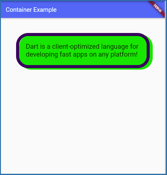
This is a simple container which has border and shadow decoration.
import 'package:flutter/material.dart';

  const Color color1 = Color.fromARGB(255, 40, 11, 90);
  const Color color2 = Color.fromARGB(255, 100, 200, 5);


  void main() => runApp(MyApp());

  /// This Widget is the main application widget.
  class MyApp extends StatelessWidget {
    @override
    Widget build(BuildContext context) {
      return MaterialApp(
        home: Scaffold(
          appBar: AppBar(
            title: Text("Container Example"),
          ),
          body: Container(
            padding: EdgeInsets.all(22),
            margin: EdgeInsets.all(50),
            decoration: BoxDecoration(
              border: Border.all(color: color1, width: 10),
              borderRadius: BorderRadius.circular(40),
              boxShadow: [
                BoxShadow(
                //  color: Colors.grey,
                //  spreadRadius: 4,
                //  blurRadius: 8,
                  color: color2,
                  offset: Offset(10.0, 5.0),
                ),
              ],
            ),
            child: Text(
                "Dart is a client-optimized language for developing fast apps on any platform!",
                style: TextStyle(fontSize: 22)),
          ),
        ),
      );
    }
  }
This is a Flutter program that displays a container with text and applies various styles using the BoxDecoration property. The program starts with the main() function that calls the MyApp() widget to run.
The MyApp widget is defined as a StatelessWidget and overrides the build() method to build the user interface. In this case, the build() method returns a MaterialApp widget that sets the home property to a Scaffold widget.
The Scaffold widget contains an AppBar widget that displays the title "Container Example" on the top of the screen.
The body of the Scaffold widget contains a Container widget that sets several properties:
- The border property is set to Border.all(color: color1, width: 10), which adds a border around the container with a color of color1 (defined earlier in the code) and a width of 10 pixels.
- The borderRadius property is set to BorderRadius.circular(40), which rounds the corners of the container to a radius of 40 pixels.
- The boxShadow property is set to a list that contains a single BoxShadow widget. This adds a shadow to the container with a color of color2 (also defined earlier in the code), an offset of (10.0, 5.0), and no spread or blur radius.
Overall, this program demonstrates how to use the BoxDecoration property to style a container with borders, shadows, and rounded corners. With Flutter's powerful styling capabilities, developers can create visually appealing user interfaces that enhance the user experience.
The Column is a widget that displays its children in a vertical order. Column widget is suitable if we want multiple widgets to be positioned in a vertical column according to their order
import 'package:flutter/material.dart';

  const Color color1 = Color.fromARGB(255, 212, 55, 55);
  const Color color2 = Color.fromARGB(255, 93, 55, 219);
  const Color color3 = Color.fromARGB(255, 55, 218, 217);
  const Color color4 = Color.fromARGB(255, 55, 219, 82);
  const Color color5 = Color.fromARGB(255, 170, 170, 20);

  void main() => runApp(MyApp());

  class MyApp extends StatelessWidget {
    @override
    Widget build(BuildContext context) {
      return MaterialApp(
          home: Scaffold(
              body: SafeArea(
                  child: Center(
                      child: Column(children: [
        Text(
          'Dart is the programming language for Flutter, the UI toolkit for building beautiful, natively compiled mobile, web, and desktop apps from a single codebase.',
          style: TextStyle(fontSize: 16, color: color1),
        ),
        Text(
          'You will write and run all the examples in DartPad, an interactive, browser-based tool that lets you play with Dart language features and core libraries. If you prefer, you can use an IDE instead, such as WebStorm, IntelliJ with the Dart plugin, or Visual Studio Code with the Dart Code extension.',
          style: TextStyle(fontSize: 16, color: color2),
        ),
        Text(
          'A new DartPad instance for every set of exercises. The link below opens a fresh instance, which contains a default "Hello" example. You can continue to use the same DartPad throughout the codelab, but if you click Reset, DartPad takes you back to the default example, losing your work',
          style: TextStyle(fontSize: 16, color: color3),
        ),
        Text(
          'A new DartPad instance for every set of exercises. The link below opens a fresh instance, which contains a default "Hello" example. You can continue to use the same DartPad throughout the codelab, but if you click Reset, DartPad takes you back to the default example, losing your work',
          style: TextStyle(fontSize: 16, color: color4),
        ),
        Text(
          'The main() method lives at the top level. In Dart, you can define code outside of classes. Variables, functions, getters, and setters can all live outside of classes.',
          style: TextStyle(fontSize: 16, color: color5),
        ),
      ])))));
    }
  }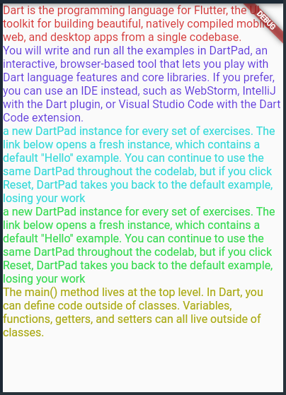
This is a Flutter program that displays several Text widgets with different font sizes and colors. The program defines five different Color constants using the Color.fromARGB() method, each of which is used to define the color of a Text widget. The main method returns a MaterialApp widget that has a Scaffold with a SafeArea widget that centers a Column of Text widgets.
In the code, all Text widgets are included in a Column widget which displays them as a vertical list of rows. The Column widget is used to vertically align its child widgets in a top-down direction. In this case, each Text widget represents a row and they are arranged vertically using the Column widget.
Each Text widget has a different font size and color defined using the style property of the Text widget. The text content of each widget displays information about the Dart programming language and its use in the Flutter framework. Overall, this program demonstrates how to use the Text widget in Flutter to display text with various styles and colors.
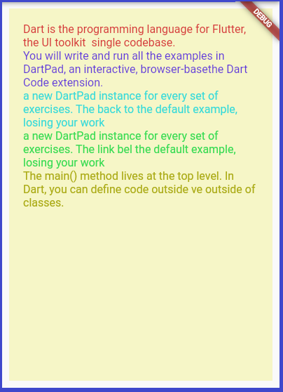
The same thing displayed on a light color background.
import 'package:flutter/material.dart';

  const Color color1 = Color.fromARGB(255, 212, 55, 55);
  const Color color2 = Color.fromARGB(255, 93, 55, 219);
  const Color color3 = Color.fromARGB(255, 55, 218, 217);
  const Color color4 = Color.fromARGB(255, 55, 219, 82);
  const Color color5 = Color.fromARGB(255, 170, 170, 20);
  const Color colorback = Color.fromARGB(100, 240, 240, 120);

  void main() => runApp(MyApp());

  class MyApp extends StatelessWidget {
    @override
    Widget build(BuildContext context) {
      return MaterialApp(
          home: Scaffold(
              body: SafeArea(
                  child: Container(
                      width: double.infinity,
                      height: double.infinity,
                      color: colorback,
                      margin: EdgeInsets.all(10),
                      padding: EdgeInsets.all(20),
                      alignment: Alignment.center,
                      //  transform: Matrix4.rotationZ(0.1),
                      child: Column(children: [
                        Text(
                          'Dart is the programming language for Flutter, the UI toolkit  single codebase.',
                          style: TextStyle(fontSize: 16, color: color1),
                        ),
                        Text(
                          'You will write and run all the examples in DartPad, an interactive, browser-basethe Dart Code extension.',
                          style: TextStyle(fontSize: 16, color: color2),
                        ),
                        Text(
                          'a new DartPad instance for every set of exercises. The back to the default example, losing your work',
                          style: TextStyle(fontSize: 16, color: color3),
                        ),
                        Text(
                          'a new DartPad instance for every set of exercises. The link bel the default example, losing your work',
                          style: TextStyle(fontSize: 16, color: color4),
                        ),
                        Text(
                          'The main() method lives at the top level. In Dart, you can define code outside ve outside of classes.',
                          style: TextStyle(fontSize: 16, color: color5),
                        ),
                      ])))));
    }
  }
This is a simple row with three vertical columns that divide the screen width into certain percentages and display text using the flexible widget.
//row tutorial
  import 'package:flutter/material.dart';

  const Color color1 = Color.fromARGB(255, 212, 55, 55);
  const Color color2 = Color.fromARGB(255, 93, 55, 219);
  const Color color3 = Color.fromARGB(255, 55, 218, 217);

  void main() {
    runApp(MyApp());
  }

  class MyApp extends StatelessWidget {
    @override
    Widget build(BuildContext context) {
      return MaterialApp(
        home: Scaffold(
          appBar: AppBar(
            title: const Text('Row tutorial'),
          ),
          body: Padding(
            padding: const EdgeInsets.symmetric(vertical: 20, horizontal: 10),
            child: Row(
              mainAxisSize: MainAxisSize.max,
              children: [
                Flexible(
                    flex: 25, // 30%
                    child: Container(
                      height: 100,
                      color: color1,
                      alignment: Alignment.center,
                      // child: Column(),
                    )),
                Flexible(
                    flex: 50, // 40%
                    child: Container(
                      height: 100,
                      padding: EdgeInsets.all(5),
                      color: color2,
                      alignment: Alignment.center,
                      child: Text(
                          "How to set background and text color in Flutter!",
                          style: TextStyle(fontSize: 25, color: Colors.white)),
                    )),
                Flexible(
                    flex: 25, // 25%
                    child: Container(
                      height: 100,
                      color: color3,
                      alignment: Alignment.center,
                      // child: Column(),
                    ))
              ],
            ),
          ),
        ),
      );
    }
  }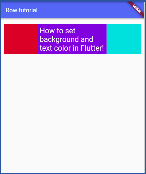
This code shows a basic example of using the Row widget in Flutter. The Row widget is used to display a horizontal row of widgets, where each child widget is placed next to the previous one. The code defines three colors as constants and uses them to set the background color of the three containers that are displayed in the Row. In the main method, the MyApp widget is created and passed to the runApp function to display it on the screen.
The MyApp class extends StatelessWidget, which means that it cannot change its state once it has been built. In the build method of MyApp, a MaterialApp widget is created, which is the top-level widget of the app.
The MaterialApp widget has a Scaffold widget as its child, which provides the basic structure for the app's layout. The Scaffold widget has an AppBar at the top with a title of "Row tutorial". The body of the Scaffold widget is a Padding widget, which adds some padding to the content displayed in the Row. The Row widget is the main content of the app and contains three Flexible widgets. Each Flexible widget has a child Container widget, which displays a colored box with some text.
Each of the Flexible widgets has a flex property that determines how much space it takes up in the Row. In this case, the first and last containers take up 25% of the available space each, while the middle container takes up 50% of the available space.
Overall, this code shows a basic example of using the Row widget to display a horizontal row of widgets in Flutter.
Back to: Flutter index